Our world is 3D, it’s interactive, it’s real-time. Well, it’s about time we bring it to the internet too!
Welcome to the age of 3D in browsers….
But wait, how do I do that?
There are several options: Flash, WebGL (Sweet Jesus) and libraries like three.js, but today let’s look into what CSS3 can do with it’s transforms
CSS 3D transforms
Before we start to get technical on the various concepts, let’s understand that CSS was built to style documents. Nevertheless, 3D animations generate plenty of opportunities to innovate in designing better and more intuitive user interactions across the site or application. A good example would be in slide shows, switching views in a weather web app and building exploratory virtual environments of places. Just imagine Google street view in 3D… Sick, right??
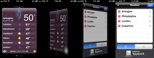
Weather web app flip animation (Credits: David DeSandro)
Concepts
Perspective
To enable 3D space view, the element needs to create an illusion of depth along the z-axis which is precisely what perspective is all about
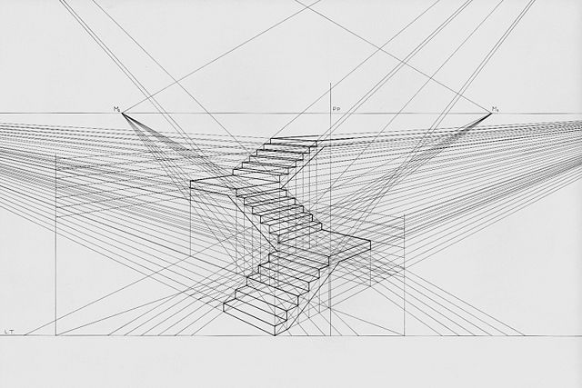
3D staircase (Credits: Luciano Testoni)
The CSS perspective: property sets an element’s position in 3D-space by affecting the distance between the Z plane and the viewer.
Demo:
[codepen_embed height=”262″ theme_id=”0″ slug_hash=”aIbAd” default_tab=”result” user=”agelber”]See the Pen <a href=’http://codepen.io/agelber/pen/aIbAd/’>Perspective Origin Demo</a> by Assaf Gelber (<a href=’http://codepen.io/agelber’>@agelber</a>) on <a href=’http://codepen.io’>CodePen</a>.[/codepen_embed]
3D Rotation
With the perspective: property being initialized we can now transform elements into 3 dimension with the z dimension or depth.
- rotateX(angle)
- rotateY(angle)
- rotateZ(angle)
Imagine a sheet of paper with a string running through the middle and now with the top corners in your fingers, you can move the card up and down, left and right, and forwards and backwards around the string. This is precisely what the rotate() function does. It rotates the element around its point of origin by the degree value mentioned.
Demo:
[iframe src=”http://s.codepen.io/jhoward/fullembedgrid/GvcBg?type=embed&animations=run” width=”100%” height=”350″]
3d Scale
This is just used to make things smaller or larger in scale. The functions scaleX(), scaleY() and scaleZ() take a numerical value which is used as a multiplier. Transformed elements don’t actually have any depth to increase or decrease, so with scaleZ() we move a 2-D object around in 3D space. So, when we use translateZ(20px) and scaleZ(2), this would translate an element by 50 px along the z-axis.
Demo:
[iframe src=”http://s.codepen.io/jhoward/fullembedgrid/zDnyH?type=embed&animations=run” width=”100%” height=”370″]
3D virtual reality? Well, you can build that too…
Experimenting with 3D transforms is always fun and I recently rebuilt Gerard Ferrandez’s 3D mirror room just to play around and master it’s 3D vector intricacies.
Click and drag to explore the room and it’s amazing views.
[codepen_embed height=”700″ theme_id=”0″ slug_hash=”KwZvre” default_tab=”result” user=”vasanthkay”]See the Pen <a href=’http://codepen.io/vasanthkay/pen/KwZvre/’>Mirror Room (CSS 3D Transforms)</a> by Vasanth Krishnamoorthy (<a href=’http://codepen.io/vasanthkay’>@vasanthkay</a>) on <a href=’http://codepen.io’>CodePen</a>.[/codepen_embed]
You can view it’s source code in my github account.
What else to know?
3D CSS transforms is a fun technique to have in your creative arsenal, but there is more to it that you can learn and play around with. Now is a great time to learn and start thinking about application of 3 dimensions in user interactions on the web. WebGL looks very promising too and I can’t wait to see what’s in store for it with. See you guys on the other side 🙂